Tips for mobile-friendly website design – StartupSmart

As mobile technology saturates the Australian market, it’s now necessary to make sure your website is mobile-friendly. Currently, more than 77% of Australians own a smartphone, while mobile accounts for more than half of all ecommerce traffic (40% mobile, 10% tablets) Google Partners research 2015.
In fact, earlier this year Google expanded their use of mobile-friendliness as a ranking signal, which you can test for your own site here. In light of all this here are some tips for mobile-friendly site design.
Go responsive
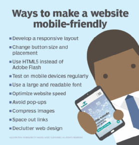
Ensure your site is responsive, meaning it will detect the device you’re using and adapt according to the screen size. Here, we recommend “starting small” by designing for the smallest screen possible before testing on larger-sized screens. Further, it’s important your users are able to switch devices and continue their searching, browsing and form-filling on a different device. In offering a simple way for users to resume their journey at a later time on a different device, with ‘share’ or ‘save’ functions, your website becomes significantly more responsive, and thus, usable.
Design for functionality
When it comes to designing your website for mobile, functionality is key. Your focus should be on menu function, site navigation, quick links and scrolling banners. For any mobile platform, designers aim to ‘think for the thumb and forefinger’ meaning all site elements should accommodate scrolling, tapping, swiping and sliding with minimal necessity for pinching, as this implies the content is too small.
A user’s first glance at a website will determine if they continue to browse through. Here, simplicity is key, whilst all critical information should be placed ‘above the fold’, like your logo, main menu, search bar, user account functions and any key promotions or popular content.
For mobile, less is always more, so conventional icons are preferable over text and they should be spaced out to avoid a user ‘mis-clicking’. It’s recommended that your tap targets are at least 48 CSS pixels tall/wide. Similarly, legible text and plenty of white space are ideal on a mobile screen.
Finally, a loading time of anything more than five seconds leaves users frustrated, so avoid including heavy graphics or content.
Make search easy
Searching and sifting through content on a mobile platform can be overwhelming, so search functions are of high importance in website design. Ensure your search bar is easily accessible from every page of your website and includes features like autocomplete and spelling suggestions, reducing the time a user takes to type information.
Your results should return the strongest first, whilst all results should be able to be filtered and sorted by relevant categories.
Forms = quick + simple
Filling out personal details and contact forms can be boring and administratively heavy, so this process should be made easy and as efficient as possible. Make sure you have a minimal number of essential fields in each form and autofill functionality is highly recommended for greater ease and efficiency. To make a form-filling process more ‘digestible’, ensure you include a progress bar that allows users to quickly see what stage of the administrative process they’re up to.
Extra Tips
If you include a link to the full desktop version of the site, the text should say “PC site” or “Desktop site”, never “full site” as it implies the mobile version is incomplete.
- On mobile, video is a must, but use it wisely.
- Take advantage of geolocation technologies that allow you to provide directions to a user’s nearest store, offer targeted promotions, link in with social networks such as Yelp, or display product prices in local currency.
- Try to include lists and bullet points instead of long-form content, as it allows users to identify key information quickly
- Give users the option to check out as a guest rather than filling out all of their details. It speeds up the process and captures a potential new customer.
Raeleen Hooper, is general manager of sales and marketing at Snap Franchising.
Raising your first round of capital? Starting a crowdfunding campaign? Want to grow your business with Instagram? StartupSmart School can help.